Monday, April 29, 2013

Movie Poster


art of the modern movie poster


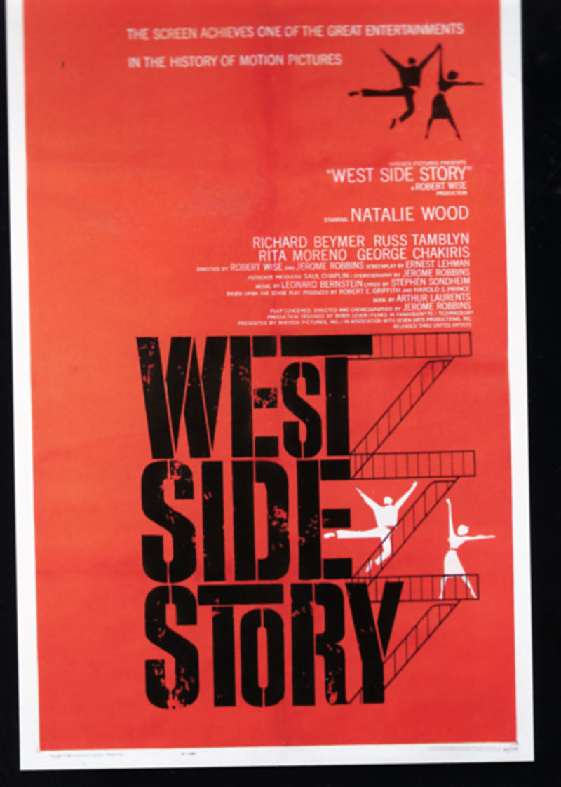
I found this in a book that was fill with old movie posters that were created and printed before computers became a tool in design.  Its astonishing that these great movie posters where never used for their DVD covers. A lot of these movies where promoted through poster unlike today where they are promoted everywhere. These posters were the only way they can advertise movies and most of the time they weren't successful in stating what the movie was about. I also noticed that most of the posters used Swiss style design which makes them look so clean and simple. These posters where made by Saul Bass.
 

Monday, April 22, 2013

Ray Bradbury

Print December 2012

Ray Bradbury is my most favorite author so when I heard of his passing I was sad. Seeing these designs made me happy. I enjoy how the composition is  arrange and the font used. Bradbury really enjoyed reading, so it was appropriate to pick Times New Roman since most books are printed in that font.

Friday, April 12, 2013

Hi


Print December 2012

The Hi on the building actually is an abbreviation for Harvard Innovation. Its a lab that has a contemporary design. The Hi really fits well with the building because of the geometric shape of the letters and how well it fits withe the square shape of the building. The typography they chose is perfect for the building; Helvetica. Its also feels as if the building is alive because it says Hi to you and you say hi back. Erin Deeley was the designer.

Monday, April 1, 2013

Seymour Chwast

Seymour: The Obsessive Images of Seymour Chwast

So I decided to pick Seymour Chwast to do a research project on. I decided him because he had some very interesting illustrations. A lot of them a bit crude and odd. I dont see how some of them are graphic design related but that's all going to change as I begin to research him. Till then here is an illustration he did that is very American Kitsch.