Graphic Design History
Wednesday, May 1, 2013
Seymour type
The Left Handed Designer
These fonts were made by Seymour Chwast. He is a famous Illustrator know for his abstract cartoony illustrations. His art is inspired by art nouveau, and art deco. These styles are definitely incorporated into these fonts. These types are very fun and cartoony. Most of these fonts where made for some of his designs.
Monday, April 29, 2013
Movie Poster
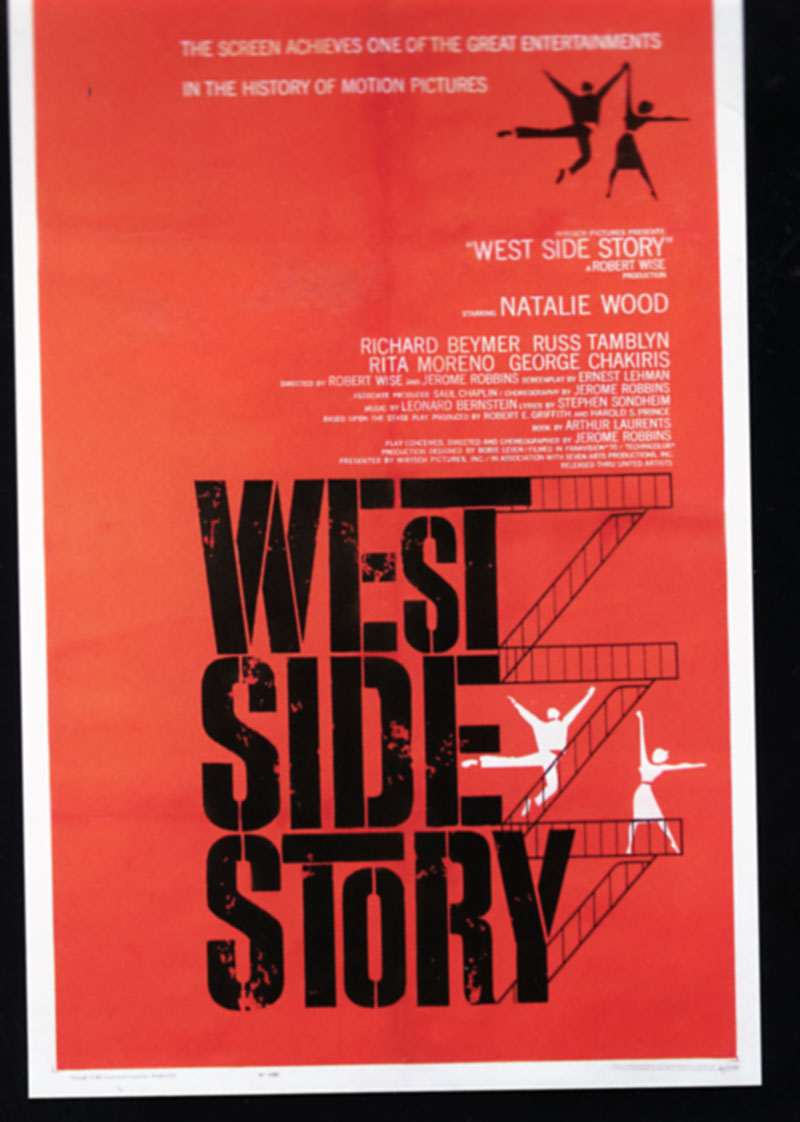
art of the modern movie poster
I found this in a book that was fill with old movie posters that were created and printed before computers became a tool in design. Its astonishing that these great movie posters where never used for their DVD covers. A lot of these movies where promoted through poster unlike today where they are promoted everywhere. These posters were the only way they can advertise movies and most of the time they weren't successful in stating what the movie was about. I also noticed that most of the posters used Swiss style design which makes them look so clean and simple. These posters where made by Saul Bass.
Monday, April 22, 2013
Ray Bradbury
Print December 2012
Ray Bradbury is my most favorite author so when I heard of his passing I was sad. Seeing these designs made me happy. I enjoy how the composition is arrange and the font used. Bradbury really enjoyed reading, so it was appropriate to pick Times New Roman since most books are printed in that font.
Ray Bradbury is my most favorite author so when I heard of his passing I was sad. Seeing these designs made me happy. I enjoy how the composition is arrange and the font used. Bradbury really enjoyed reading, so it was appropriate to pick Times New Roman since most books are printed in that font.
Friday, April 12, 2013
Hi
Print December 2012
The Hi on the building actually is an abbreviation for Harvard Innovation. Its a lab that has a contemporary design. The Hi really fits well with the building because of the geometric shape of the letters and how well it fits withe the square shape of the building. The typography they chose is perfect for the building; Helvetica. Its also feels as if the building is alive because it says Hi to you and you say hi back. Erin Deeley was the designer.
Monday, April 1, 2013
Seymour Chwast
Seymour: The Obsessive Images of Seymour Chwast
So I decided to pick Seymour Chwast to do a research project on. I decided him because he had some very interesting illustrations. A lot of them a bit crude and odd. I dont see how some of them are graphic design related but that's all going to change as I begin to research him. Till then here is an illustration he did that is very American Kitsch.
So I decided to pick Seymour Chwast to do a research project on. I decided him because he had some very interesting illustrations. A lot of them a bit crude and odd. I dont see how some of them are graphic design related but that's all going to change as I begin to research him. Till then here is an illustration he did that is very American Kitsch.
Wednesday, March 27, 2013
Evolution of logos
I thought it would be interesting to post this. I had found this image in a graphic design book that had a bunch of logos designed by many designers. Here is the evolutionary change of the Starbucks logo. Has time goes by, many things change some have to change just to accommodate to today society views and beliefs. Starbucks had started out with a very provocative logo that later on changed probably to avoid a lot of sexual and inappropriate jokes.
Tuesday, March 12, 2013
Jarrito
Comunication Arts Magazine
Jarrito is fruity Mexican soda that is very popular outside of Mexico. Many people enjoy drinking it along side a meal which they had bought in a food-truck. However it is a bit of an inconvenience to open these for their customers. So Jarriot give away illustrated bottle openers to every food-truck that served Jarrito. Each one had a very intricate design that was inspired by Mexican art and culture. It was designed by Federico Archuleta.
Subscribe to:
Comments (Atom)


